A coastline is, at any honest scale of inspection, infinite. The mathematician Benoît Mandelbrot made this observation famous in 1967 with his question "How long is the coast of Britain."
The answer depends on the ruler.
A chart, which must fit a coastline onto a sheet of paper or a screen of finite resolution, must therefore choose what to leave out. The choices are not arbitrary. They are governed by a set of cartographic conventions known collectively as generalization.
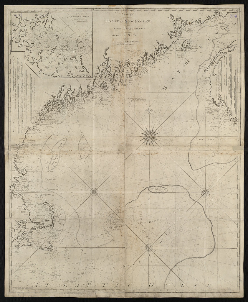
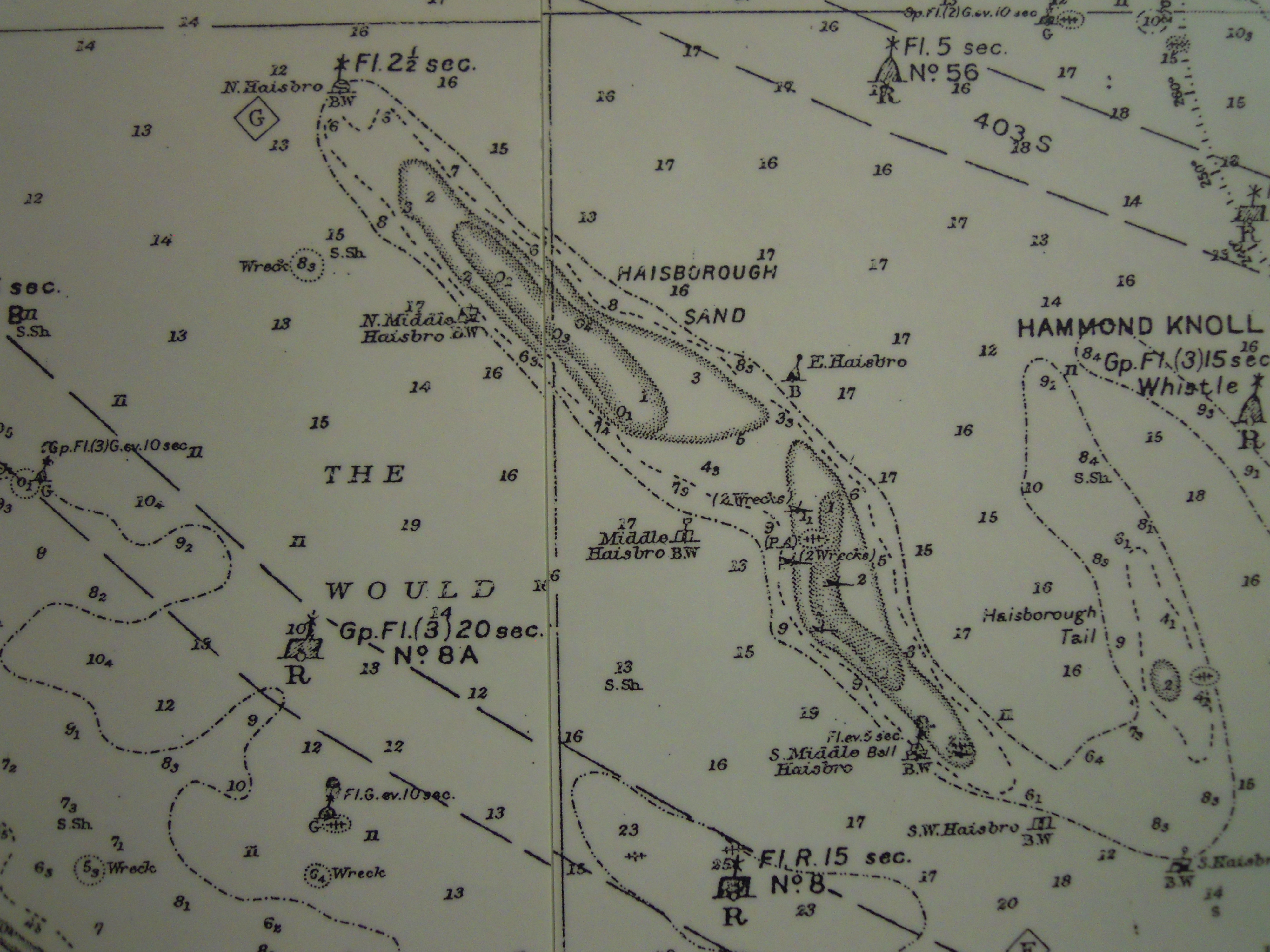
On the morning of 19 May 2026 the writer laid out three NOAA charts of the same stretch of Massachusetts coast, from Marblehead to Cape Ann, on the floor of a friend's living room in Beverly Farms.
Chart 13275, at 1:80,000, showed the whole stretch on a single sheet roughly the size of a placemat. Chart 13276, at 1:40,000, covered the same waters on a sheet four times the area. Chart 13279, at 1:20,000, covered the inner harbours at sixteen times the area of the original.
The comparison was instructive.
On the 1:80,000 chart, the harbour at Manchester-by-the-Sea was reduced to a small notch in the coastline with a single sounding of 14 feet. The breakwater at the harbour entrance, which is 240 meters long, was rendered as a thin line perhaps 1.5 millimetres long on the paper.
On the 1:40,000 chart, the same harbour acquired distinct moorings, three anchorage symbols, four soundings, and a clearly visible breakwater with its terminal mark.
On the 1:20,000 chart, the harbour had a labelled fairway, individually marked private moorings, the position of the harbormaster's office, depths along the fairway at 50-meter intervals, and a small inset showing the float pattern at the public landing.
Each chart was, in its own terms, accurate. None was complete.
What is left out at smaller scales is governed by what cartographers call selection criteria. Soundings shallower than a certain threshold are always shown. Aids to navigation visible from a certain distance are always shown. Hazards within a certain proximity of the navigable channel are always shown.
Everything else is filtered out as the scale shrinks. The filtering is not random. It is documented, in NOAA's case, in the agency's Nautical Chart Manual, which runs to several hundred pages.
The most visible form of generalization is line simplification. The shoreline itself, on the 1:20,000 chart, follows every cove and headland with what appears to be high fidelity. On the 1:80,000 chart, the same shoreline is smoothed: small coves are filled in, small headlands are clipped, the line becomes more general.
This is not an error. It is a feature. If the small-scale chart attempted to render every cove and headland at its true position, the result would be illegible.
The trade-off is that a skipper navigating with only the small-scale chart will see a coast that is, in its detail, fictitious. The cove that looks like a possible refuge on the 1:80,000 chart may, on the 1:20,000 chart, prove to be a beach with no protection.
The general rule is that a chart should be used at its design scale, neither magnified nor reduced. On paper, this is enforced by the physical chart. On a plotter, where the user can zoom freely, it is enforced only by the user's awareness.
A chartplotter zoomed in beyond the design scale of the underlying chart data will continue to draw the coastline, but the coastline drawn will be the generalized one, scaled up. The cove will still be filled in. The skipper will see what looks like detail and will be looking, in fact, at smoothed approximations.
This phenomenon is sometimes called "overzoom." Most modern plotters indicate overzoom with a warning of some kind, usually a hash pattern across the chart or a notice in the corner. Users learn quickly to ignore these warnings.
They should not.
The opposite problem, underzoom, is less dangerous but still misleading. A large-scale chart viewed at very small scale will show all the detail it contains, but the detail will be too cluttered to read. The user will then zoom in, and the chart will look more legible, and the user will trust it more than the underlying scale warrants.
The honest user of a chart, paper or electronic, treats the design scale as the right scale.
By late afternoon the three charts had been refolded along their original creases and put away. The skipper who owned them, an old friend of the writer's named Phillip Brewster, has kept all three for thirty-one years.
He says he could probably do without the small-scale chart, but he keeps it because it is the one that shows him the whole context of where he is going.
He could probably do without the large-scale chart too, he said, but he keeps it because it is the one that shows him exactly where the rocks are.
The middle chart, he said, is the one he actually uses.
Filed under